When working with guests of Saybrook Home, our design team ordinarily begins with their overall design aesthetic and the color palette that inspires and speaks to them. It’s also important to consider the client’s lifestyle and the function of the space.
Designer Ashley Vivienzo recently walked us through a project she has been working on for a client who was looking for a fresh, updated look for a second home along the CT shoreline. The design was a collaborative effort between Ashley, her client and our design team here at Saybrook Home.
Seaside Garden
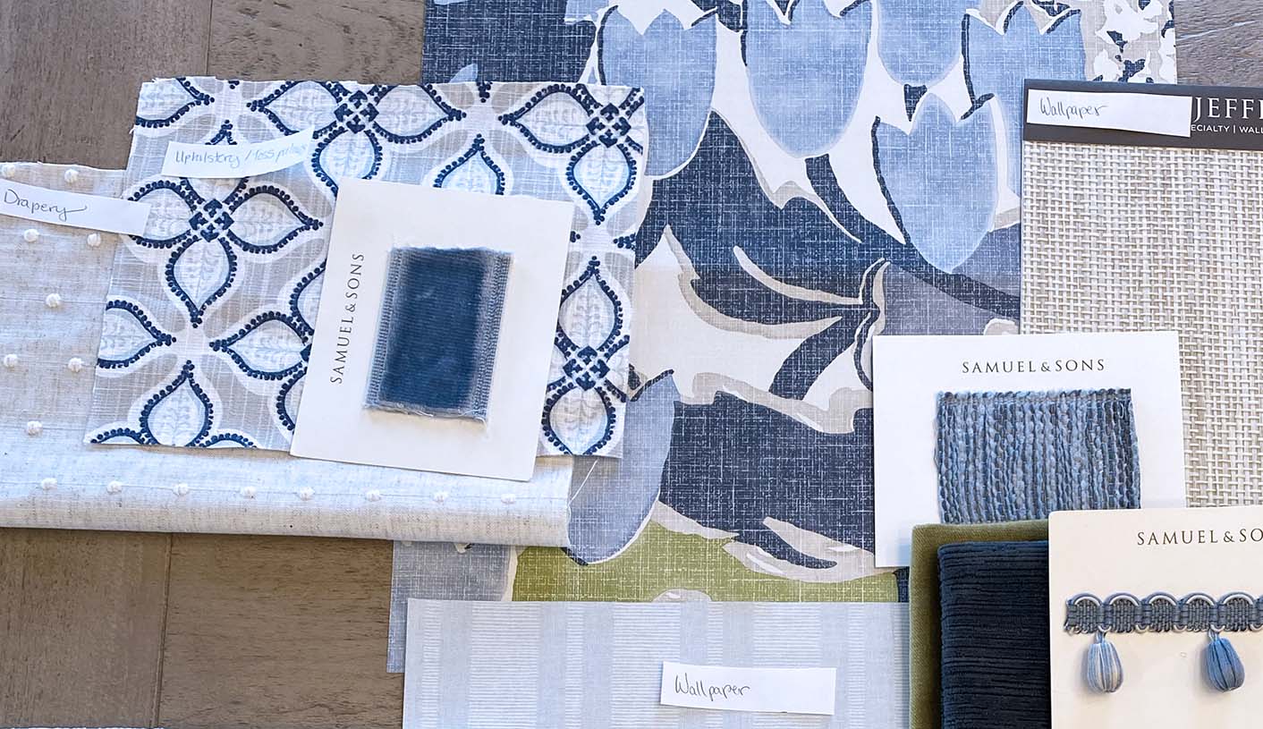
Ashley wanted the overall feel of the room to mimic the natural beauty of our coastline during the summer months. She used a blue and green color palette with neutral, sandy tones splashed in. A very coastal aesthetic leaned a little toward the traditional with ornate tapes and trims giving just a hint of maximalism.
At Saybrook Home, it’s pretty standard to begin a design by focusing first on the rugs, upholstery pieces and wallpaper to start to create the overall look a client is trying to achieve. Some of these elements may help define the color palette further. Toss pillows and window treatments can help create the story and refine the overall look.
Ashley began this particular design with a stunning wallpaper by Anna French. The whimsical, floral design pulls in all the essential colors and really acts as a jumping off point for the entire look.
Layering with Pattern
To create interest in any design plan, our designers like to layer fabrics with different patterns, textures and colors. By combining small, medium and large scale print there is more visual interest and detail to draw your eye around the room.
A great example of this layering effect can be seen in Ashley’s design in the choice of wallpapers and window treatment materials. Three different wallpapers were selected. The botanical print by Anna French, another geometric Anna French selection in a light blue and a Phillip Jeffries grasscloth wallpaper. By combining the large-scale pattern floral, with a small geometric print and then the textural grasscloth, Ashley created a harmonious backdrop for the rest of the design.

The same principle applied to the window treatments. Ashley chose a swiss dot small pattern neutral for window sheers, coupled with a printed cotton in a medium pattern for drapery panels. Topped with a lead edge tape with chenille texture (in a couple different options to offer the client), the combination adds an abundance of interest.
Color Story
With regards to the color palette, working with complementary colors can help create a more vibrant design while tonal colors or colors with a similar hue is more of a subtle look. In Ashley’s beach home design, blue and green are analogous colors, meaning they sit side by side on the color wheel, which makes them true companions from a design standpoint.
Texturally Speaking
Other than the grasscloth wallpaper, texture plays a role in different areas of the design. The upholstery on the sofa is planned to have a very plush neutral which also happens to be a performance fabric (a must for a beach home). Toss pillows in a velvety fabric with dainty ball fringe from Samuel & Sons also add a nice touch.
Finishing Touches
Trim and decorative elements will enhance a design as they offer additional texture and design moments. This is similar to the way adding jewelry to an outfit can make it feel complete. Consider the dramatic navy blue fringe Ashley has chosen for the ottoman - what an eye-catching element!

When all is said and done, Ashley’s inspiration board will eventually evolve into the space (or spaces) of her client’s dreams. Each element chosen to work in harmony with the others to bring this vision to life.

To begin your own design journey, book an appointment with Ashley Vivenzio today! Click here.


Leave a comment
This site is protected by hCaptcha and the hCaptcha Privacy Policy and Terms of Service apply.